Color Theory
Shooting color photos can be difficult at times. Sometimes black and white photographs tend to simplify a scene, while color can be distracting and take away from a photo.
A quick lesson in color theory will help you learn how to make colors be more successful in a photograph. Below are some practical tips of how you can better shoot photography in color.
A quick lesson in color theory will help you learn how to make colors be more successful in a photograph. Below are some practical tips of how you can better shoot photography in color.
Complementary Colors
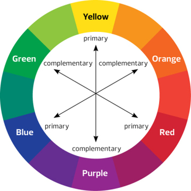
Complementary colors are colors that are across from each other on a color wheel. Complementary colors tend to work really well together– and create a nice harmony that feel balanced. Below are some photos that have great complementary colors. Most of the images were taken by Steve McCurry– one of the best color photographers alive.
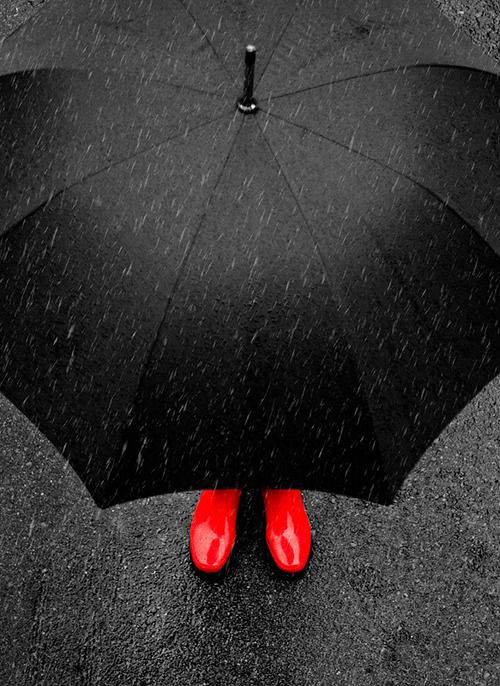
Red and Green
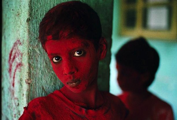
In this captivating portrait McCurry captured– you see two kids covered in all red powder. The kid in the foreground is looking straight at the camera, with his piercing eyes and inquisitive look. The background is a blueish-greenish hue, with some red marks on the left of the wall– and another kid blurred in the right of the frame. Do you see the red and green complementary colors in this shot? Because the background is a greenish-blue hue, the red of the kid’s face really pops out from the background. This red-green dynamic also occurs in one of his most famous photos– the Afghan Girl:
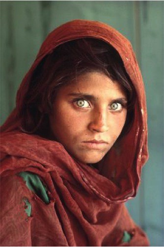
The red-green dynamic here is quite amazing. First of all, you have a simple green background, and hints of green in her tattered shirt– and of course, those amazing green eyes. In terms of red, you see it in her clothing, and her skin. It creates a nice rhythm that alternates between red and green.
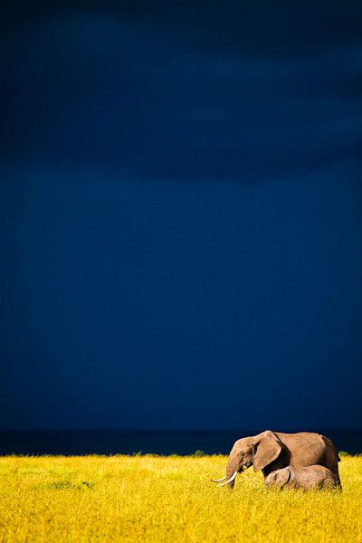
You can also see how having a certain color predominantly occupying the background– and having one figure as a complementary color, can create a strong figure-to-ground relationship.
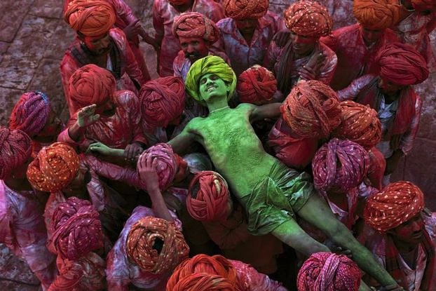
For example, in the photo below– we see a predominantly red background– with the one figure of the man in green. What happens? The green pops out at us:
You can also see how having a certain color predominantly occupying the background– and having one figure as a complementary color, can create a strong figure-to-ground relationship.
For example, in the photo below– we see a predominantly red background– with the one figure of the man in green. What happens? The green pops out at us:
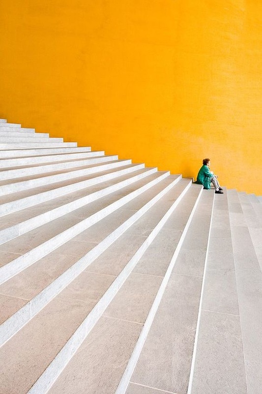
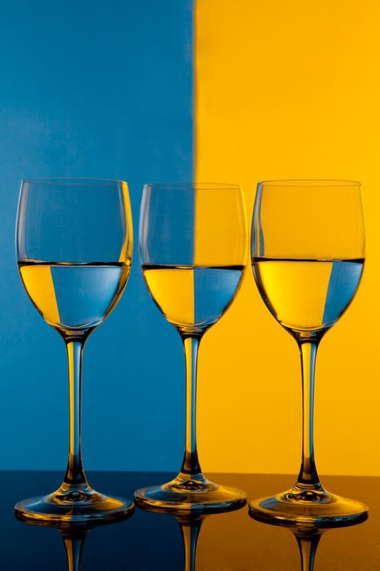
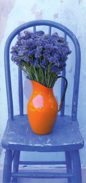
Orange and Blue
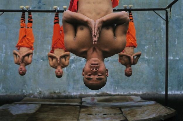
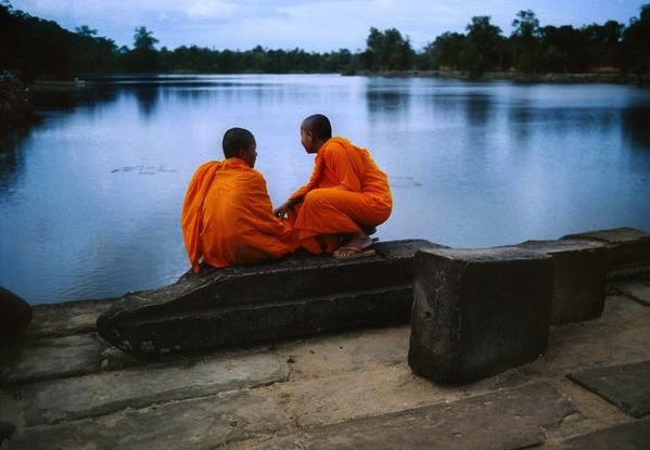
Some other complementary colors include the orange-blue dynamic. Steve McCurry has tons of great examples — mostly of monks. Note the orange of the monk's skin and clothes juxtaposed against the faint blue of the background.
Warm vs. Cool
Another color theory comes to “Warm” vs “Cool” colors. What are warm and cool colors? For warm colors– think about colors of a sunset (reds, oranges, yellows):
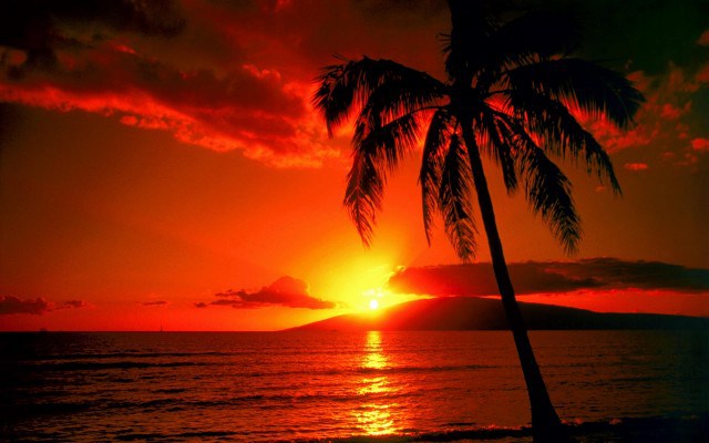
Cool colors can be visualized through water (blues, greens, violets):

So the theory of “warm” vs “cool” colors is that warm colors tend to be more active– and advance to you in a photo and cool colors tend to recede into the background— and are less active. Let's look at some examples of warm vs cool colors:
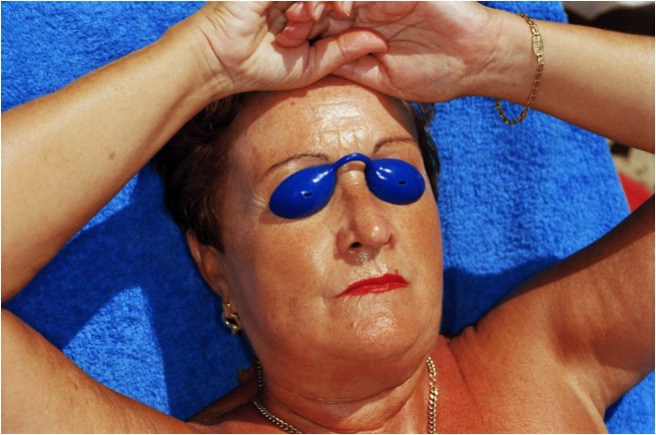
In this photo by Martin Parr, you can see how the skin of the woman is warm. Her skin is a orangeish-red hue. And the little blue eyepiece that covers her eyes are a deep blue– that pop out at you the viewer.
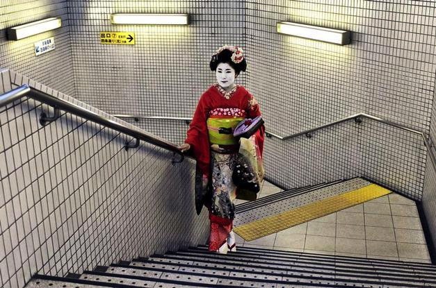
In another photo by Steve McCurry of a Geisha in Kyoto– you see that the warm color of her red kimono pops out from the cool background color that is a dirty white-grey.
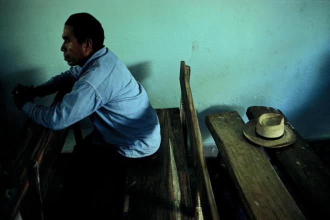
There are also photos out there that have primarily cool colors. These photos make you feel more calm, relaxed, and are much more mellow. In this photo by David Alan Harvey, you have a man looking as if he has his fingers interlocked as in prayer. Behind him is what seems to be his hat– sitting quietly by itself. Then the pastel-blue-green (and his blue shirt) create a calm and relaxed mood. It perfectly fits the somber mood of the man in prayer.
There are also photos out there that have primarily cool colors. These photos make you feel more calm, relaxed, and are much more mellow. In this photo by David Alan Harvey, you have a man looking as if he has his fingers interlocked as in prayer. Behind him is what seems to be his hat– sitting quietly by itself. Then the pastel-blue-green (and his blue shirt) create a calm and relaxed mood. It perfectly fits the somber mood of the man in prayer.
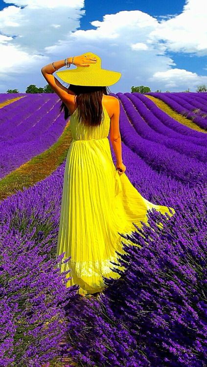
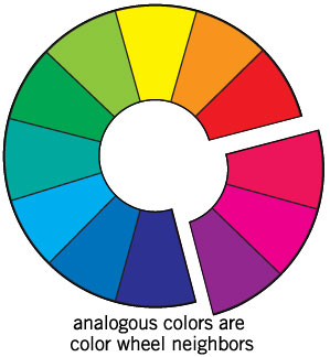
Analogous Colors
Analogous Colors are also another color theory. The idea is pretty much that colors close to one another on the color wheel create a certain feeling and mood.
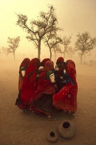
In the famous photo below by Steve McCurry– you have all these women huddled together in a sandstorm. The primary colors are the red of their dresses, and the orangeish-yellow hint of the sandstorm in the background. It creates a warmth in the photo– of the women protecting one another against the terror of the ferocious sandstorm.
In the photo below — you see a man donning a red suit, complete with a pale yellow shirt, bright yellow sunglasses, and a striped orange tie. The background colors are predominantly warm (with the yellow seats and tables)– with a bit of cool colors on the top of the frame:

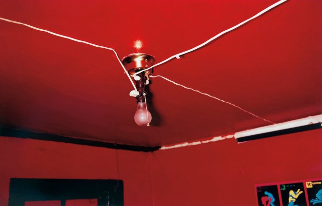
One of William Eggleston’s most famous images is that of a light bulb on top of a blood-red background, a great example of analogous color theory.
When shooting color photographs, look for colorful people, colorful scenes, or colorful things and determine whether the colors work in harmony or not.
Project Requirements
Go on a hunt for color theory. Shoot a variety of color schemes: warm, cool, analogous, complementary. You will be turning in your top 5 photographs that emphasize color and you will be posting which color theory category they fall under.